Design and UXMobile-friendly websites12 min reading time15,066 characters2,307 words
Wireframe — what the sketch settles, and what code can no longer undo
What a wireframe decides, why the same change costs thirty times more once built, and how to test one with five people before you approve it.
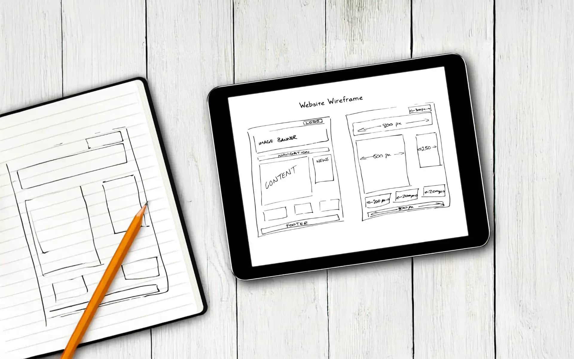
The wireframe is the most commonly skipped stage of a website project and the cheapest moment at which anything can still be changed. It gets skipped because it shows no progress — it is black and white, ugly, and looks like something drawn in five minutes.
That impression costs you the difference between moving a block on a sketch and moving it on a live site. The difference is roughly thirty-fold, and we will show where it comes from.
Wireframe, mockup, prototype — three words, three different things
Clients use them interchangeably, and each settles something different, appears at a different stage and costs differently. Confusing them is the most common reason a conversation about a project takes a wrong turn.
Wireframe — the skeleton. Low fidelity, a black-and-white layout of blocks. No photographs, no colours, no typeface beyond the default. It settles what is on the page, in what order and what outranks what. That is the only thing you are judging at this stage — and deliberately, nothing else can be judged on it.
Mockup — the visual layer. High fidelity, the full visual design: brand colours, typography, photographs, icons, button states. It settles how it looks. It is built on an approved wireframe, not instead of one.
Prototype — the behaviour. A clickable model, usually in a design tool, where buttons lead to further screens. It settles whether the path makes sense before anyone writes a line of code. On a simple company site it can be unnecessary; on a multi-step form, a configurator or a customer portal it saves the most.
The practical consequence: if you are handed a "wireframe" with colours and photographs, you have been handed a mockup — and the conversation will move to the shade of a button before anyone checks whether the form is in the right place.

Wireframe, mockup and prototype — what each one settles
Own analysis
What the sketch settles, and what it no longer can
Four decisions are taken on a wireframe, and all four are expensive to undo in code.
What is visible without scrolling. The opening screen holds a single most important thing, not four equal ones. Deciding which one is a business decision, not a graphic one — and on a sketch that choice is visible immediately, because there are no colours to mask it.
The order of sections. Whether testimonials come before or after the description of the offer. Whether pricing sits above the form. These are block moves that take minutes on a sketch.
The path to action. How many steps separate arriving on the site from sending an enquiry, and how many of them are genuinely needed. Every unnecessary step is easier to remove now than once it has its own component, its own URL and its own tests.
What will not fit at all. The most uncomfortable and most valuable function of a wireframe: it shows you cannot fit everything, and forces a choice before circumstance makes it for you.
What you do not settle on a wireframe: colours, photographs, typefaces, exact copy. If the conversation at this stage moves to those subjects, the stage is being wasted.
What the same change costs at each stage
Moving a form higher up is a quarter of an hour in a design tool at the wireframe stage. The same change on a live site is a different operation, and it is worth understanding why — because the difference comes from neither bad faith nor an inflated quote.
A layout change in code pulls a chain behind it:
- rebuilding the component that renders the block, together with its phone and desktop variants,
- changing the content structure in the management system, if the block has fields of its own that have to be added, moved or removed,
- fixing the queries that fetch the data, because the component now asks for something else,
- refactoring the styles, so the new layout does not break the sections next to it,
- regression tests, meaning checking that nothing which used to work broke along the way.
Each of those steps is small on its own. Together they turn a quarter of an hour into fifteen to thirty hours of work including testing.

The same change at two moments in the project
A quarter of an hour on a sketch against a rebuild in working code
Our own rates, arithmetic set out in the article
The ratio is therefore roughly 1:30, and that is the whole economics of this stage. A wireframe is not worth what it costs to draw — it is worth what finding the same problem three months later would cost.
How to test a wireframe before you approve it
The usual way a sketch gets judged is that the person commissioning the site looks at it and says "looks good". That is the weakest possible test, because that person knows the offer by heart and knows where to look for everything.
There is a cheaper and far more effective method, and it has a documented basis. Jakob Nielsen published it on 18 March 2000 and it has since become one of the best-confirmed rules in the field: a test with five users finds about 85% of usability problems.
The figure is not plucked from the air — it follows from a formula in which a single user finds on average about 31% of the problems, and subsequent users largely repeat the same discoveries. After the fifth person the curve flattens: users six to fifteen cost as much as the first five and add a dozen percentage points.

The five-user rule — the problem-detection curve
Formula from the Nielsen Norman Group publication, own calculation
The same publication carries a second conclusion, less often quoted and more practical: the same budget is better spent on three tests of five people than on one test with fifteen. After the first test you fix what surfaced, and the second test examines the corrected version instead of confirming known problems again.
How to do this on a wireframe, with no tools and no budget:
Write three tasks, not questions. Not "what do you think of this layout", but "find the pricing and get to sending an enquiry". A question about opinion produces an opinion; a task produces behaviour.
Sit five people from outside the project down with it. They do not have to be customers — at this stage, people who do not know the site will do. Somebody from accounts, somebody from your family, the neighbour from the next office.
Watch, do not explain. The moment you explain where to click, the test is over. A ten-second hesitation is a result, even if the person eventually gets there.
Write down places, not impressions. "Three of five people looked for pricing in a menu that does not have it" is a result a designer can act on. "They liked it" is not.
This is the line of defence before you spend money on a developer: a problem found here costs a moved block rather than a rebuilt component.
How to read a wireframe you did not draw
You are handed a file of grey rectangles and asked to approve it. Five questions make the difference at that moment — all of them askable without any technical knowledge.
"What should somebody arriving here do?" If the answer is "familiarise themselves with the offer", go back to the brief. The answer should be an action: send the form, call, book a slot. Then check whether that action is the most visible thing on the sketch.
"Why does this block sit here?" Every section should have a reason other than "that is how it is usually done". A designer who can justify the order has thought about it; a designer who answers "it is a standard layout" has reproduced a template.
"What is missing here that was in the brief?" A wireframe always loses something, because not everything fits — that is its function. What matters is that it was a decision rather than an oversight. Go through the brief point by point and tick them off.
"What happens when the copy is twice as long?" On a sketch the text is placeholder and conveniently short. Yours will be longer. A block designed for a three-word headline falls apart at eight, and you find out after launch.
"Which elements will I be able to change myself?" On a sketch this question looks premature, and it is the last moment at which the answer is cheap. A block meant to be editable has to be designed that way — adding it later is the same rebuild the cost section describes.
One thing not worth doing at this stage: collecting opinions from five colleagues at once. A wireframe invites comments about appearance, because it looks raw, and each additional person adds their own preferences. Better to appoint one decision-maker and run the task-based test from the section above — that produces behaviour instead of preference.
A phone is not a smaller version
The most common mistake in company wireframes: the layout is drawn for a wide screen and the phone version is produced by narrowing it. That does not work, because on a narrow screen blocks stack one under another and order becomes hierarchy — what sat to the side on a desktop lands at the end on a phone.
The consequence is concrete. If on a wide screen the contact form sits in the right-hand column and the service description on the left, then on a phone somebody has to scroll through the entire description before seeing the form. On a sketch you see it in five seconds; in finished code it is a component rebuild.

A phone is not a smaller version — order becomes hierarchy
Digital Vantage, own diagram
Three things worth settling on the wireframe separately for the narrow screen:
What stays at the top. A desktop fits a headline, an image and a call to action. A phone fits one of them. Choose which, instead of letting the order in the code choose for you.
What disappears and what collapses. A menu, a comparison table, a long list of references — each needs designed behaviour on a narrow screen. "We'll see how it turns out" means it will turn out by accident.
Where contact lands. In service businesses the phone number is the most used element on the site, and on a phone it has to be tappable and visible without scrolling. That is one decision on a sketch and one of the most expensive to undo later, because it touches a header present on every page.
How it went for us — and what the wireframe did not save
We have one implementation where we tested this deliberately, and we present it with a caveat that is part of the result: it is a demonstration site, not a client engagement, so it speaks to method rather than to sales.
We started not from a sketch but from an information architecture written as a contract: every node of the site was given a goal, an audience, a list of sections, fields in the content management system and refresh rules. The effect was what we hoped for — the wireframes were drawn from that document without a round of scope rewriting, meaning without the characteristic loop in which a sketch reveals the scope was set wrongly and you return to a conversation from two weeks earlier.
And now the part we will not skip, because it is more interesting: three design decisions did not survive contact with the code. Things that looked settled on the sketch turned out in implementation to be unworkable or pointless, and had to be changed along the way. We recorded that divergence as material rather than sweeping it away — because it is the real boundary of this method.
The conclusion has two halves and both matter. A wireframe shortens the path to a decision and removes the most expensive layout mistakes. But it does not replace contact with implementation: some things are only learned once code exists, and a project budget should assume that instead of pretending nothing changes after a sketch is approved.
The methodological claim itself — that good information architecture turns into sketches without a round of corrections — is for us a claim to be confirmed on the next implementation, not a rule. One implementation is one implementation. The full description of that project is in the portfolio, together with the list of things that went differently from what we assumed.
Low-fi or hi-fi — and when it does not matter
Wireframes are divided into low and high fidelity, and the choice is simpler than the guides suggest.
Low fidelity is grey rectangles and captions. It takes hours, and it is enough for a conversation about layout and for a test with five people. In most company projects that is all you need.
High fidelity is a sketch with real proportions, real copy and real spacing — still without colours and without photographs. It makes sense where information density is what is being settled: comparison tables, data dashboards, configurators.
And the most common client mistake, the one that costs the stage its purpose: a conversation about colours and typefaces over a low-fidelity sketch. Until layout and content priority are agreed, adding a visual layer is work that will have to be done a second time. The sketch is ugly on purpose — that is its function, not its flaw.
A practical rule: if a sentence about a shade is spoken at a wireframe meeting, go back to the question of whether that block is in the right place at all.
When a wireframe is unnecessary
Worth saying, because this whole text defends one stage and there are situations in which that stage adds nothing.
When the site is built on a ready-made template you do not intend to rebuild. The template is the wireframe — the layout has already been settled by somebody else, and your decision comes down to choosing a template and filling it with content. Drawing a sketch and then hunting for a template that resembles it is work in reverse.
When there are three pages and each is one screen. A brochure site with a description, contact details and pricing has no architecture to design. The conversation about what sits higher fits in one paragraph of an email.
When you are rebuilding one section of an existing site. The context is already fixed, and sketching a single block is often slower than showing it straight away in its final appearance.
And the borderline case where the answer is "yes anyway": when somebody in the company holds a strong view about how the site should look. Then the sketch is a cheaper place for that conversation than a finished visual design — and it is the only way we know of keeping it off the stage where every change costs thirty times more.
What this text does not settle
What the whole project process looks like. The wireframe is one of several stages and we show them in the order they happen.
What to agree before the sketch. Goals, audience and scope are settled in the brief, and the wireframe only draws them — separate text.
How to design a site that converts. Layout is one layer; the other is the content inside it. The design section goes deeper there.
What a project costs. The rates behind the 1:30 arithmetic are ours and cover one line item. A full project quote is the cost section.
Where these numbers come from
- 85% of usability problems with five users, and the recommendation of three tests of five — Jakob Nielsen, Why You Only Need to Test with 5 Users, Nielsen Norman Group, 18 March 2000. The curve in the figure is computed from the formula given in that publication, at a value of 31% of problems found by a single user.
- The 1:30 ratio between a change on a sketch and the same change in code — our own rates and our own arithmetic, set out step by step in the cost section. It is not a market benchmark and we do not present it as one.
- The implementation where we tested the method — a demonstration site described in our portfolio, not a client engagement, and it is described that way in the text. The three divergences between design and implementation come from its own report.
- What is not here: the previous version of this text carried seven case studies with percentage outcomes and a return on investment of 2100%. None of them had a client name, before-and-after data or permission to publish, so they were removed in full rather than corrected.
Wireframe on the table and no idea what to judge on it?
A quarter of an hour over the actual sketch: whether the layout answers what the site is being built for, and what becomes expensive if you leave it as it is.
Related Posts
- Website design process — the order in which changing your mind is still free
How a website actually gets built, stage by stage. Find the stage you are in and skip the rest — plus the three things that stall projects.
- 1.The website brief — six things an agency has to guess without
Six things an agency has to guess without, and what each omission costs. Plus the most common mistake: writing solutions instead of the problem.
- 2.A static website in HTML — when it is enough, and what happens when it stops being enough
Four conditions that have to hold at once, what maintenance really costs, and the three thresholds past which a static site stops paying off.
- 3.How to build a website — four decisions, the layout, and what really stretches a project
What to settle before anyone designs a screen, what has to be on the page, how long it really takes, and what happens on launch day.
- 1.